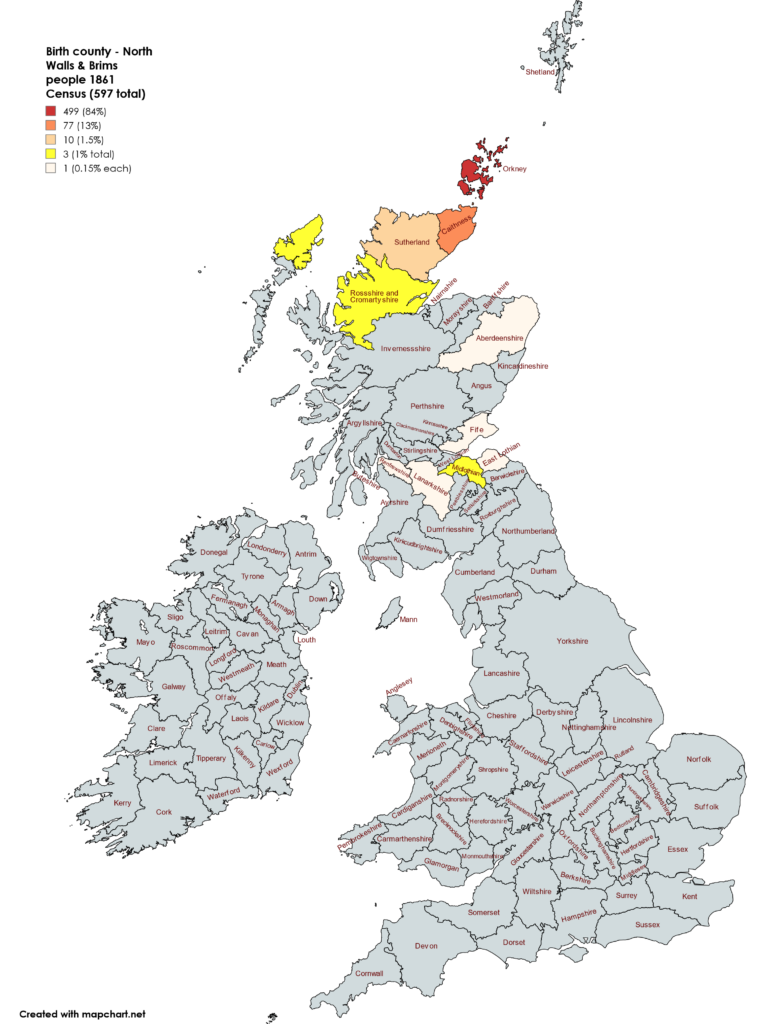
I’ve been experimenting with the MapChart website to produce maps showing the birth county of people in North Walls and Brims in two censuses, 1861 and 1921. What do you think?
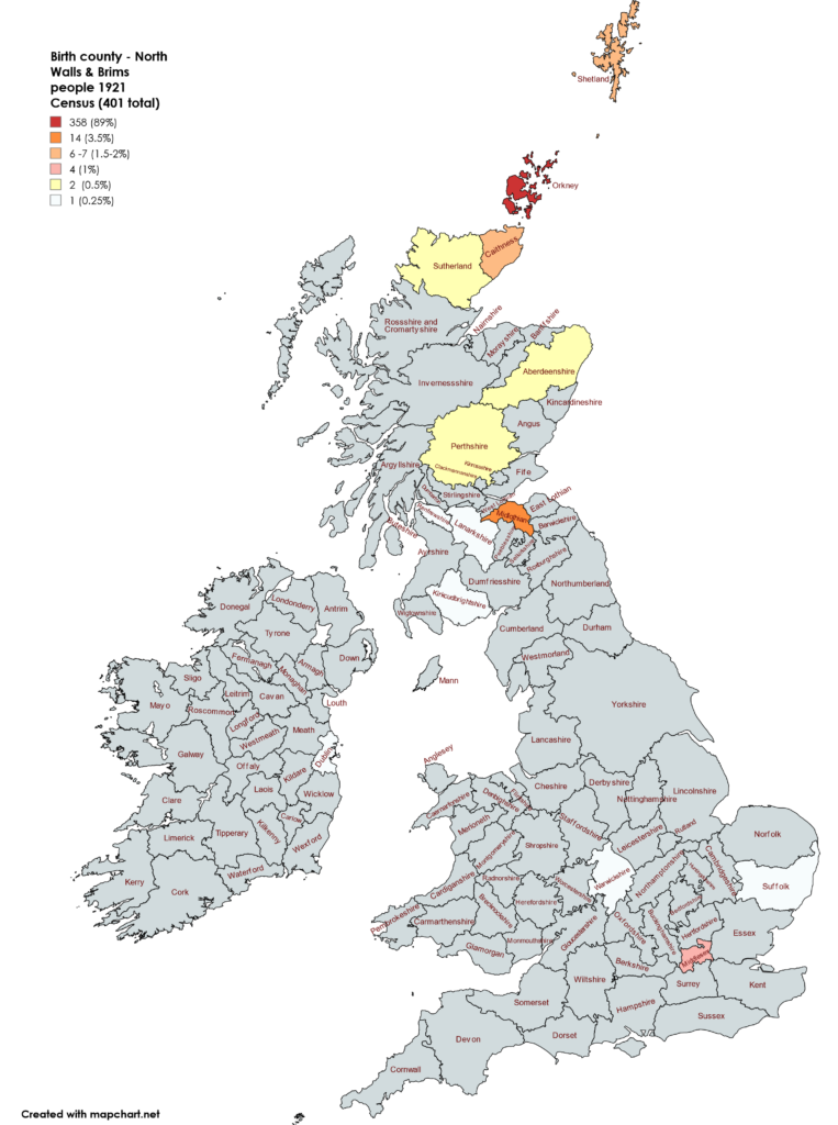
And here’s 1921, a much smaller population, 401 rather than 597, but a wider spread of birthplaces partly due to the Naval base at Lyness.
Interesting but I need to be more consistent with colours. The ability to map the parishes of birth for Orkney and Caithness would be good.
I think your experiment worked well. I liked that I was able to choose my own colours and thus could make them more distinct than some toools (like the Microsoft excel mapping tool) that seemed to use gradations of colour and it did not show up as well. I think though your scale of colours works well.
Thanks Anne. It's a really useful tool. I'm pondering using it for death places of my 1861 Census population though a lot of them died abroad – a lot of emigration.